

Contents
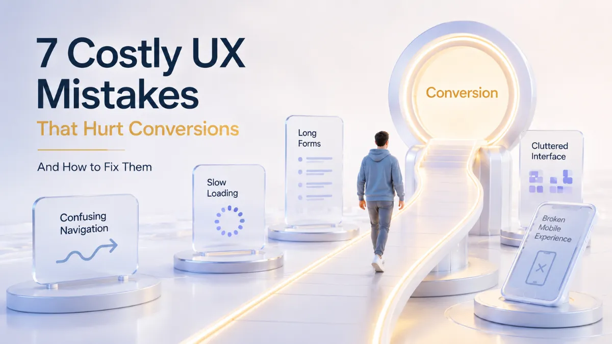
- 1 1. Introduction: Why UX Has a Direct Impact on Conversions
- 2 2. What Are UX Mistakes and Why Do They Reduce Conversions?
- 3 3. UX Mistake #1: Confusing Navigation
- 4 4. UX Mistake #2: Inconsistent Mobile Experience
- 5 5. UX Mistake #3: Slow and Friction-Filled Interfaces
- 6 6. UX Mistake #4: Unclear Calls-to-Action (CTAs)
- 7 7. UX Mistake #5: Long and Complicated Forms
- 8 8. UX Mistake #6: Visual Clutter and Information Overload
- 9 9. UX Mistake #7: Ignoring Accessibility
- 10 10. How Great UX Naturally Improves Conversion Rates
- 11 11. How CrossShores Infotech Builds Conversion-Focused Digital Experiences
- 12 12. Frequently Asked Questions (FAQs)
- 13 Conclusion: Better UX Creates Better Business Results
1. Introduction: Why UX Has a Direct Impact on Conversions
Great digital experiences don’t happen by accident.
Behind every high-converting website, successful mobile app, or engaging digital product is a user experience that feels simple, intuitive, and effortless. When users can quickly find information, navigate confidently, and complete actions without frustration, they are far more likely to become customers.
This is why understanding UX mistakes that hurt conversions has become increasingly important for businesses that want to improve engagement, generate more leads, and drive sustainable growth.
A strong user experience design strategy helps users move naturally through the customer journey. Clear navigation, fast-loading pages, effective calls-to-action, mobile-friendly experiences, and accessible interfaces all contribute to better outcomes. In contrast, common UX design mistakes can create friction that prevents users from taking action, ultimately affecting website conversion optimization efforts.
Quick Answer
UX mistakes that hurt conversions are usability and design issues that create friction during the user journey, making it harder for visitors to complete desired actions such as purchasing a product, submitting a form, or contacting a business.
Today’s users have higher expectations than ever before. They expect fast, seamless, and consistent experiences across every device and touchpoint. Even small usability issues can influence trust, engagement, and overall conversion rate optimization performance.
In this guide, we’ll explore the most common UX mistakes that hurt conversions, understand their impact on business performance, and discover practical solutions that help create more effective digital experiences.
2. What Are UX Mistakes and Why Do They Reduce Conversions?
Every website, mobile app, or digital product is designed with a goal in mind. Whether it’s generating leads, increasing sales, encouraging sign-ups, or boosting engagement, success depends on how easily users can complete their desired actions.
This is where user experience becomes critical.
UX mistakes that hurt conversions occur when design decisions create friction, confusion, or frustration during the user journey. Instead of guiding users smoothly toward a goal, these issues interrupt their progress and make it harder to take action.
In many cases, businesses focus heavily on marketing and traffic generation while overlooking the user experience. As a result, they attract visitors but struggle to convert them into customers.
2.1 Understanding UX Friction
UX friction is anything that slows users down or forces them to think unnecessarily.
Examples include:
- Complex navigation menus
- Slow-loading pages
- Unclear calls-to-action
- Long forms
- Poor mobile experiences
- Visual clutter
- Accessibility barriers
Each of these issues may seem minor on its own. However, together they can significantly impact conversion-focused UX design and reduce overall business performance.
Simply put:
The more effort users must invest, the less likely they are to complete a desired action.
This principle applies to e-commerce websites, SaaS platforms, mobile applications, and virtually every digital experience.
2.2 How Poor UX Impacts User Behavior
Users make decisions quickly.
Research consistently shows that visitors form impressions within seconds of arriving on a website. If the experience feels confusing or difficult, many users leave before exploring further.
Common consequences of poor user experience design include:
- Higher bounce rates
- Lower engagement
- Reduced trust
- Increased cart abandonment
- Lower lead generation
- Declining customer retention
For example, a visitor interested in your services may leave simply because they cannot find the contact page quickly enough.
Similarly, a customer ready to make a purchase may abandon the process if the checkout form feels unnecessarily complicated.
These are classic UX design mistakes that directly impact conversions.
2.3 The Hidden Cost of Bad UX
Many businesses underestimate how expensive poor UX can be.
When UX mistakes that hurt conversions remain unresolved, organizations often experience:
| UX Issue | Potential Business Impact |
|---|---|
| Confusing navigation | Lost opportunities and higher bounce rates |
| Slow website performance | Reduced engagement and conversions |
| Poor mobile usability | Lower mobile conversion rates |
| Unclear CTAs | Missed leads and sales |
| Complex forms | Increased abandonment rates |
| Accessibility problems | Smaller reachable audience |
The cost isn’t always immediately visible.
Instead, it appears through lost revenue, lower customer satisfaction, and missed growth opportunities over time.
2.4 Why Conversion-Focused UX Matters
Modern consumers have endless alternatives.
If a website feels difficult to use, users can switch to a competitor within seconds.
This is why successful businesses invest in conversion rate optimization and website conversion optimization strategies that prioritize usability.
A conversion-focused approach ensures that every element of the user journey serves a purpose:
- Navigation helps users find information quickly.
- CTAs guide users toward action.
- Forms reduce unnecessary effort.
- Mobile experiences remain consistent.
- Accessibility improves usability for everyone.
When these elements work together, users are more likely to trust the brand, stay engaged, and complete valuable actions.
Key Takeaway
Understanding UX mistakes that hurt conversions is the first step toward improving digital performance.
Great user experiences don’t happen by accident. They are created through intentional design decisions that remove friction, simplify interactions, and help users achieve their goals effortlessly.
In the next section, we’ll examine one of the most common conversion killers: confusing navigation and how it silently drives potential customers away.
Imagine walking into a large shopping mall without signs, directions, or store maps.
You would probably feel frustrated and leave before finding what you came for.
The same thing happens online.
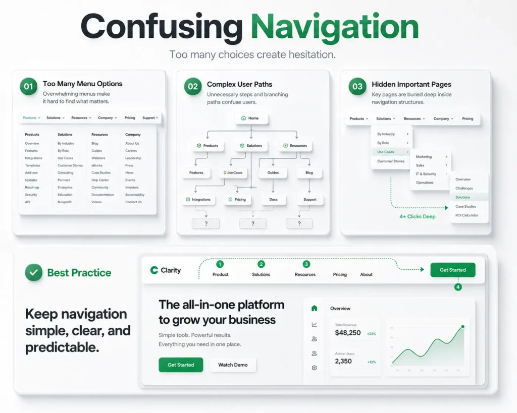
One of the most common UX mistakes that hurt conversions is confusing navigation. When users cannot quickly find information, products, services, or the next step in their journey, they are more likely to abandon the experience altogether.
No matter how good your product is, users won’t convert if they can’t easily navigate your website or application.
Navigation acts as the roadmap of a digital experience.
It helps users:
- Discover information
- Explore products and services
- Understand website structure
- Complete desired actions
- Move confidently through the user journey
When navigation is clear and intuitive, users stay engaged longer and are more likely to take action.
This is why effective navigation plays a major role in conversion-focused UX design.
Many businesses unknowingly create navigation systems that make sense internally but confuse actual users.
Common warning signs include:
Too Many Menu Options
When users are presented with too many choices, decision-making becomes difficult.
This phenomenon is often called “choice overload.”
Instead of exploring further, users may simply leave.
Unclear Menu Labels
Navigation labels should be simple and predictable.
Terms like:
- Solutions
- Resources
- Explore
- Discover
may sound professional, but they often fail to clearly communicate what users will find.
Hidden Important Pages
Critical pages such as:
- Pricing
- Contact
- Services
- Product Information
should never be difficult to locate.
When users have to search extensively for important information, trust and engagement decline.
Inconsistent Navigation Across Devices
A navigation menu that works well on desktop but becomes confusing on mobile creates friction and negatively impacts mobile UX design performance.
Poor navigation directly affects several key business metrics:
| Navigation Problem | Impact on Conversions |
|---|---|
| Too many menu items | Increased user confusion |
| Hidden key pages | Lower lead generation |
| Unclear labels | Higher bounce rates |
| Poor mobile navigation | Reduced mobile conversions |
| Complex site structure | Lower engagement |
These issues may appear small individually, but collectively they create significant barriers to conversion.
Businesses can improve navigation by following a few proven principles:
Keep Navigation Simple
Limit menu options to the most important categories.
The goal is clarity, not complexity.
Use Familiar Language
Users should immediately understand where each menu item leads.
Choose straightforward labels over creative terminology.
Prioritize Important Actions
Pages that support website conversion optimization should be highly visible.
Examples include:
- Contact Us
- Request a Quote
- Book a Demo
- Pricing
- Get Started
Optimize for Mobile Users
Navigation should remain intuitive across all screen sizes.
Since mobile traffic continues to grow, mobile usability is essential for effective user experience design.
Real-World Example
Imagine a software company with the following navigation:
- Solutions
- Platform
- Innovation
- Resources
- Insights
- Ecosystem
While these labels may seem modern, they provide little clarity.
A user looking for pricing or service information may become frustrated.
A simplified navigation such as:
- Services
- Solutions
- Pricing
- Case Studies
- Contact
makes the user journey significantly easier.
Key Takeaway
Confusing navigation is one of the most damaging UX mistakes that hurt conversions because it creates friction at the very beginning of the user journey.
Users should never have to guess where to click next.
By simplifying navigation, using clear labels, and prioritizing important actions, businesses can improve usability, increase engagement, and support stronger conversion rate optimization results.
In the next section, we’ll explore another major conversion killer: inconsistent mobile experiences and why mobile-first usability is no longer optional.
4. UX Mistake #2: Inconsistent Mobile Experience
More than half of today’s web traffic comes from mobile devices.
Yet many businesses still design their digital experiences primarily for desktop users and treat mobile optimization as an afterthought. This creates one of the most common UX mistakes that hurt conversions.
Users expect the same level of usability, speed, and functionality regardless of the device they use. When a website works perfectly on desktop but becomes difficult to navigate on a smartphone, users quickly lose patience and leave.
In today’s digital landscape, a poor mobile experience doesn’t just frustrate users it directly impacts revenue, engagement, and business growth.
4.1 Why Mobile UX Matters
Modern consumers constantly switch between devices.
A user may:
- Discover a business on social media through mobile
- Research products on a tablet
- Complete a purchase on a desktop
Throughout this journey, they expect consistency.
When the experience feels disconnected, trust declines and conversions suffer.
This is why strong mobile UX design is a critical component of both user experience design and website conversion optimization.
4.2 Common Mobile UX Problems
Many businesses unknowingly create mobile experiences that make completing simple tasks unnecessarily difficult.
Tiny Buttons and Clickable Elements
Users should never struggle to tap buttons or links.
Small touch targets often lead to accidental clicks, frustration, and abandonment.
Poor Mobile Navigation
Desktop navigation structures rarely translate perfectly to smaller screens.
Menus that are difficult to access or understand can quickly become major barriers to conversion.
Slow Mobile Performance
Mobile users are even less patient than desktop users.
A few extra seconds of loading time can significantly reduce engagement and conversion rates.
Content That Doesn’t Adapt Properly
Text that requires zooming, images that overflow screens, and poorly aligned layouts create unnecessary friction.
These are common UX design mistakes that negatively impact the user journey.
Inconsistent User Flows
Users should be able to perform the same actions regardless of device.
When features are available on desktop but difficult to access on mobile, users often abandon the process entirely.
4.3 How Poor Mobile Experiences Reduce Conversions
The relationship between mobile usability and conversions is direct.
| Mobile UX Issue | Impact on Conversions |
|---|---|
| Slow load times | Higher bounce rates |
| Difficult navigation | Lower engagement |
| Small buttons | Increased frustration |
| Poor responsiveness | Lower mobile conversions |
| Broken user flows | Higher abandonment rates |
Even minor usability issues can prevent users from completing actions such as:
- Making purchases
- Filling out forms
- Requesting quotes
- Booking appointments
- Contacting businesses
This is why addressing UX mistakes that hurt conversions on mobile devices should be a top priority.
4.3 Mobile-First UX Best Practices
Businesses looking to improve conversion-focused UX design should adopt a mobile-first mindset.
Design for Smaller Screens First
Prioritize essential content and actions.
Users should immediately understand what to do next without excessive scrolling or searching.
Simplify Navigation
Mobile menus should be easy to access and contain only the most important options.
Clarity always outperforms complexity.
Optimize Performance
Fast-loading pages improve both user satisfaction and conversion rate optimization outcomes.
Every second saved helps maintain momentum in the user journey.
Make CTAs Easy to Tap
Primary calls-to-action should be highly visible and large enough to interact with comfortably.
Test Across Multiple Devices
A design that works on one smartphone may perform differently on another.
Regular testing helps identify usability issues before they impact users.
Key Takeaway
An inconsistent mobile experience is one of the most costly UX mistakes that hurt conversions because it disrupts the user journey at critical moments.
Today’s users expect seamless interactions across every device. Businesses that prioritize mobile UX design create more engaging experiences, improve customer satisfaction, and generate stronger conversion results.
In the next section, we’ll explore another major conversion killer: slow and friction-filled interfaces that cause users to abandon websites before taking action.
5. UX Mistake #3: Slow and Friction-Filled Interfaces
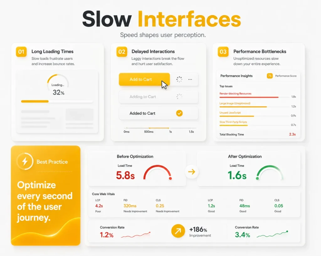
Users expect digital experiences to be fast, smooth, and effortless.
When a website or application responds quickly, users remain engaged and continue moving toward their goals. But when pages load slowly, actions feel delayed, or workflows become unnecessarily complicated, users often abandon the experience before converting.
This is why slow and friction-filled interfaces remain one of the most damaging UX mistakes that hurt conversions.
Even if your product is valuable and your marketing attracts the right audience, a frustrating experience can prevent users from taking action.
5.1 Why Speed Matters More Than Ever
In today’s digital world, users have little patience for delays.
Whether someone is browsing products, requesting a quote, or filling out a contact form, they expect immediate responses.
A slow interface creates uncertainty.
Users begin to wonder:
- Is the website working?
- Did my action register?
- Should I refresh the page?
- Is there a better alternative elsewhere?
These doubts increase abandonment rates and negatively impact conversion rate optimization efforts.
5.2 Common Sources of UX Friction
Friction occurs whenever users encounter unnecessary obstacles during their journey.
Some of the most common causes include:
Slow Page Load Times
Large images, excessive scripts, and poorly optimized websites often create delays that frustrate users.
Too Many Steps
Every additional click, screen, or process increases the likelihood of user drop-off.
The simpler the journey, the higher the chance of conversion.
Delayed Feedback
Users expect immediate confirmation when they:
- Submit forms
- Add items to a cart
- Click buttons
- Complete transactions
Without feedback, users may feel uncertain and abandon the process.
Complicated Workflows
Complex checkout experiences, lengthy onboarding processes, and difficult account creation flows are common UX design mistakes that reduce engagement.
5.3 How Slow Interfaces Impact Conversions
Performance issues affect both user satisfaction and business outcomes.
| UX Friction Point | Impact on User Behavior |
|---|---|
| Slow page loads | Higher bounce rates |
| Long workflows | Increased abandonment |
| Delayed responses | Lower user trust |
| Complex processes | Reduced conversions |
| Poor performance on mobile | Lower mobile engagement |
These problems directly undermine website conversion optimization because users are less likely to complete their intended actions.
5.4 The Psychology Behind Speed
Users associate speed with professionalism and trust.
A fast experience communicates:
- Reliability
- Competence
- Efficiency
A slow experience often creates the opposite impression.
Even when the product itself is excellent, poor performance can make a business appear outdated or unreliable.
This is why performance optimization plays a critical role in conversion-focused UX design.
5.5 Best Practices for Reducing UX Friction
Businesses can significantly improve conversions by simplifying interactions and improving performance.
Optimize Website Speed
Reduce unnecessary scripts, compress images, and improve server performance.
Faster websites create smoother user experiences.
Minimize Steps
Ask only for information that is truly necessary.
Every additional step should have a clear purpose.
Provide Instant Feedback
Users should immediately know that their action was successful.
Loading indicators, confirmation messages, and progress states improve confidence.
Streamline User Journeys
Every interaction should move users closer to their goal.
Remove unnecessary barriers wherever possible.
Prioritize Mobile Performance
Since many users browse from smartphones, strong mobile UX design is essential for reducing friction and improving engagement.
5.6 Real-World Example
Imagine two websites offering the same service.
The first loads instantly, provides clear feedback, and allows users to request a quote in two simple steps.
The second takes several seconds to load, requires multiple form pages, and provides little confirmation during the process.
Most users will naturally prefer the first experience.
This illustrates how small usability improvements can have a significant impact on conversions.
Key Takeaway
Slow and friction-filled interfaces are among the most expensive UX mistakes that hurt conversions because they interrupt momentum during critical moments of the user journey.
Businesses that prioritize speed, simplicity, and seamless interactions create better experiences for users and stronger outcomes for the business.
In the next section, we’ll explore another major conversion obstacle: unclear calls-to-action and why users often fail to take action when the next step isn’t obvious.
6. UX Mistake #4: Unclear Calls-to-Action (CTAs)
A user may love your website.
They may read your content, explore your services, and trust your brand.
But if they don’t know what to do next, they probably won’t take action.
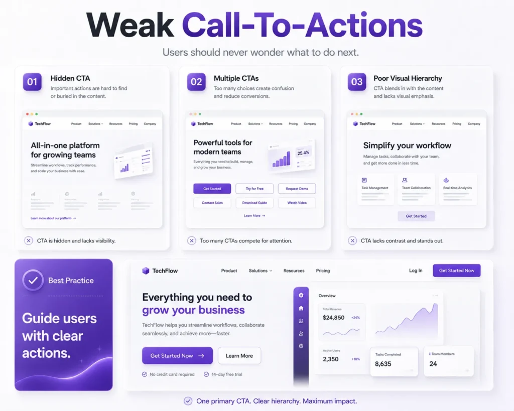
This is why unclear calls-to-action are one of the most overlooked UX mistakes that hurt conversions.
Every page should guide users toward a specific goal. Whether it’s requesting a quote, booking a demo, making a purchase, or contacting your team, users should never have to guess the next step.
When CTAs are unclear, hidden, or poorly designed, businesses lose valuable conversion opportunities.
6.1 What Is a Call-to-Action?
A call-to-action (CTA) is any element that encourages users to take a desired action.
Examples include:
- Get Started
- Request a Demo
- Contact Us
- Download Now
- Book a Consultation
- Start Free Trial
Effective CTAs help users move smoothly through the conversion journey.
They are a critical component of conversion-focused UX design because they bridge the gap between user interest and user action.
6.2 Why Users Ignore CTAs
Many businesses assume users will naturally know what to do next.
Unfortunately, that is rarely the case.
Visitors often need clear guidance.
Common reasons CTAs fail include:
Generic CTA Text
Buttons labeled:
- Submit
- Click Here
- Learn More
often lack motivation and context.
Users respond better when the value is clear.
Poor Placement
If users cannot easily find the CTA, they are unlikely to act.
Important actions should be visible without excessive searching.
Too Many Competing CTAs
When every section contains a different call-to-action, users become overwhelmed.
This creates decision fatigue and reduces conversions.
Weak Visual Hierarchy
CTAs should stand out from surrounding content.
Buttons that blend into the design are easy to overlook.
These are common UX design mistakes that negatively affect engagement and conversion performance.
6.3 How Unclear CTAs Impact Conversions
A confusing CTA creates uncertainty.
When users are unsure about:
- What happens next
- What value they will receive
- How much effort is required
they often choose not to act at all.
This directly impacts website conversion optimization and reduces business results.
| CTA Problem | Conversion Impact |
|---|---|
| Generic button text | Lower click-through rates |
| Poor visibility | Reduced engagement |
| Too many options | Decision paralysis |
| Weak messaging | Lower conversion rates |
| Inconsistent placement | User confusion |
6.4 Best Practices for High-Converting CTAs
Businesses can improve conversions by making CTAs more visible, specific, and action-oriented.
Use Clear Action Words
Strong examples include:
- Get Your Free Consultation
- Request a Custom Quote
- Start Your Free Trial
- Schedule a Demo
Users immediately understand what they will receive.
Focus on One Primary Action
Each page should have a clear objective.
Avoid presenting multiple competing actions that distract users.
Create Visual Contrast
CTAs should naturally attract attention through placement, spacing, and design hierarchy.
Position CTAs Strategically
Place CTAs where users are most likely to be ready for action:
- After explaining benefits
- At the end of important sections
- Near pricing information
- After solving a user problem
Optimize for Mobile Users
A strong mobile UX design strategy ensures CTAs remain visible and easy to interact with across all devices.
Real-World Example
Imagine a service company website.
CTA Version A:
Submit
CTA Version B:
Get Your Free Project Consultation
The second option clearly communicates value and reduces uncertainty.
This small change can significantly improve conversion rate optimization because users understand exactly what happens next.
Key Takeaway
Unclear calls-to-action are among the most preventable UX mistakes that hurt conversions.
Users should never have to guess their next step.
By creating clear, visible, and value-driven CTAs, businesses can guide users more effectively through the customer journey and increase conversions naturally.
In the next section, we’ll explore another major usability issue: long and complicated forms that cause users to abandon the conversion process before completion.
7. UX Mistake #5: Long and Complicated Forms
Forms play a crucial role in digital experiences.
Whether users are signing up for a service, requesting a quote, subscribing to a newsletter, or completing a purchase, forms are often the final step before conversion.
Unfortunately, many businesses make the mistake of asking for too much information.
As a result, users become frustrated and abandon the process.
This makes lengthy forms one of the most common UX mistakes that hurt conversions.
The reality is simple:
The more effort users must invest, the less likely they are to complete the action.
7.1 Why Form Design Matters
Forms act as a bridge between user interest and business goals.
A well-designed form helps users complete tasks quickly and confidently.
A poorly designed form creates friction that interrupts momentum.
Even users who are genuinely interested in your product or service may abandon the process if it feels too time-consuming.
This is why form optimization is an important part of conversion-focused UX design.
7.2 Common Form Design Mistakes
Many organizations unintentionally create forms that discourage users from completing them.
Asking for Too Much Information
One of the biggest mistakes is requesting information that isn’t immediately necessary.
Examples include:
- Company size
- Industry details
- Secondary phone numbers
- Extensive personal information
Every additional field increases friction.
Multi-Step Processes Without Clear Progress
Users are more likely to abandon forms when they don’t know how much longer the process will take.
Uncertainty creates frustration.
Poor Error Handling
Nothing is more frustrating than completing a long form only to receive vague error messages.
Clear feedback improves usability and trust.
Difficult Mobile Experiences
Forms that work well on desktop often become frustrating on smaller screens.
This is why strong mobile UX design is essential.
Unclear Field Requirements
Users should immediately understand:
- Which fields are required
- What format is expected
- What information is needed
Poor communication leads to unnecessary errors and abandonment.
These are all common UX design mistakes that reduce conversion rates.
7.3 How Long Forms Hurt Conversions
Long and complex forms introduce friction at the most critical stage of the user journey.
| Form Issue | Impact on Conversions |
|---|---|
| Too many fields | Higher abandonment rates |
| Poor mobile usability | Lower mobile conversions |
| Confusing instructions | Increased user frustration |
| Weak error handling | Reduced completion rates |
| Multi-step complexity | Lower lead generation |
When users encounter unnecessary obstacles, many simply leave and look for easier alternatives.
This negatively impacts website conversion optimization efforts and reduces business opportunities.
7.4 Best Practices for High-Converting Forms
Businesses can significantly improve performance by simplifying the form experience.
Ask Only for Essential Information
Every field should have a clear purpose.
If information isn’t immediately necessary, consider collecting it later.
Reduce the Number of Steps
The fewer actions users must complete, the higher the likelihood of conversion.
Use Smart Form Design
Features such as:
- Auto-fill
- Dropdown selections
- Input suggestions
- Progress indicators
help reduce user effort.
Optimize for Mobile Devices
A seamless mobile UX design experience ensures forms remain easy to complete on smartphones and tablets.
Provide Clear Feedback
Users should instantly know:
- When they’ve made an error
- How to fix it
- When the form has been successfully submitted
Real-World Example
Consider two lead generation forms.
Form A
- First Name
- Last Name
- Phone Number
- Company Name
- Industry
- Employee Count
- Budget Range
- Project Requirements
- Preferred Contact Time
Form B
- Name
- Message
Most users will complete Form B because it requires less effort.
Once the conversation begins, additional information can be gathered naturally.
This demonstrates how reducing friction improves conversion rate optimization outcomes.
Key Takeaway
Long and complicated forms are one of the easiest UX mistakes that hurt conversions to fix.
By simplifying form design, reducing unnecessary fields, and improving usability, businesses can create smoother user journeys that encourage more users to complete valuable actions.
In the next section, we’ll explore how visual clutter and information overload distract users from what truly matters and quietly reduce conversion performance.
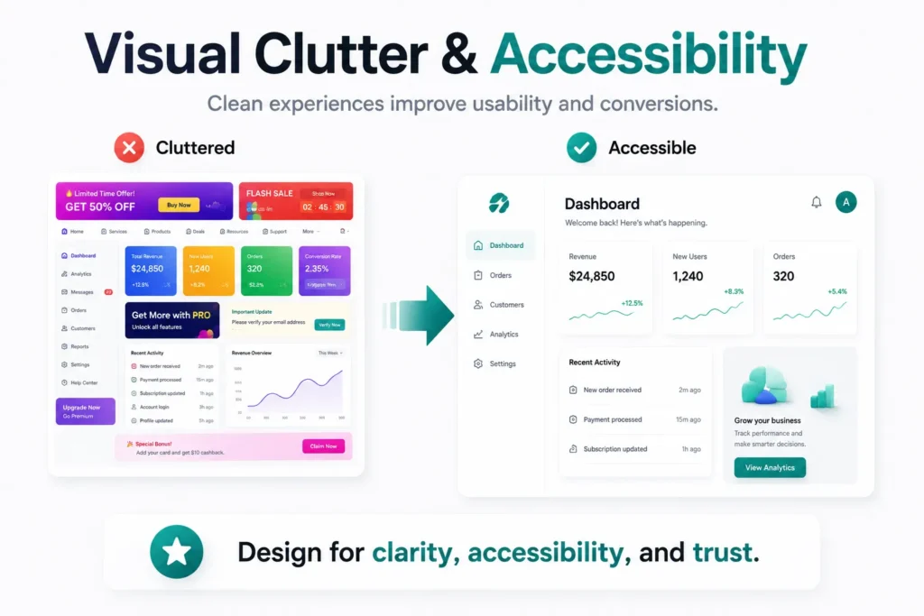
8. UX Mistake #6: Visual Clutter and Information Overload
When users visit a website, they should immediately understand what matters most.
Unfortunately, many businesses try to communicate everything at once.
Multiple banners, competing calls-to-action, excessive text, pop-ups, animations, and crowded layouts often create confusion rather than clarity.
This makes visual clutter one of the most damaging UX mistakes that hurt conversions.
Instead of guiding users toward action, cluttered interfaces overwhelm them and make decision-making more difficult.
The result is lower engagement, reduced trust, and fewer conversions.
8.1 What Is Visual Clutter?
Visual clutter occurs when too many elements compete for a user’s attention simultaneously.
Examples include:
- Excessive text blocks
- Multiple CTA buttons
- Too many colors
- Overuse of animations
- Crowded layouts
- Large numbers of images
- Too many navigation options
While each element may seem important individually, together they create cognitive overload.
Users don’t know where to focus.
8.2 Why Simplicity Improves User Experience
The best digital experiences are often the simplest.
Clean interfaces are also shaped by modern design practices. If you want to explore the latest approaches to creating visually engaging and user-friendly interfaces, read our article UI Design Trends That Are Shaping Modern Digital Experiences.
Successful user experience design focuses on helping users complete tasks quickly and confidently.
When unnecessary distractions are removed, users can:
- Find information faster
- Understand content more easily
- Make decisions confidently
- Complete actions with less effort
This is why simplicity plays a major role in conversion-focused UX design.
In many cases, removing elements improves performance more than adding new ones.
8.3 How Visual Clutter Hurts Conversions
Clutter creates friction because users must process more information before taking action.
This slows decision-making and increases abandonment rates.
Common consequences include:
Reduced Focus
Users struggle to identify the most important content or action.
Decision Fatigue
Too many options make users less likely to choose any option at all.
Lower CTA Visibility
Important conversion actions become lost among competing elements.
Decreased Trust
Overcrowded designs often appear unprofessional and difficult to navigate.
These issues directly impact website conversion optimization and overall user satisfaction.
| Visual Clutter Issue | Impact on User Behavior |
|---|---|
| Too many CTAs | Decision paralysis |
| Excessive content | Lower engagement |
| Crowded layouts | Reduced readability |
| Overuse of colors | User distraction |
| Multiple competing messages | Lower conversions |
8.4 Signs Your Website May Be Too Cluttered
Many businesses become so familiar with their websites that they fail to notice clutter.
Warning signs include:
- Every section contains a CTA
- Important content is difficult to locate
- Pages feel crowded on mobile devices
- Users frequently ask where to find information
- Bounce rates remain high despite strong traffic
These indicators often point to underlying UX design mistakes that require simplification.
8.4 Best Practices for Reducing Visual Clutter
Prioritize One Primary Goal Per Page
Every page should have a clear purpose.
Users should immediately understand what action you want them to take.
Use White Space Strategically
White space improves readability and helps important elements stand out.
It is not wasted space, it is a design tool.
Simplify Content Presentation
Break information into:
- Short paragraphs
- Bullet points
- Clear headings
- Easy-to-scan sections
This improves both usability and readability.
Create a Strong Visual Hierarchy
Users should naturally notice:
- The main message
- Key benefits
- The primary CTA
Everything else should support this journey.
Optimize for Mobile Experiences
A clean mobile UX design ensures users can focus on essential content without distractions.
8.5 Real-World Example
Imagine a landing page featuring:
- Three navigation menus
- Multiple pop-ups
- Five CTA buttons
- Auto-playing videos
- Long paragraphs
- Flashing promotional banners
Most users will feel overwhelmed.
Now compare that to a page with:
- One clear headline
- Three key benefits
- One primary CTA
- Clean spacing
- Simple navigation
The second experience feels easier, more trustworthy, and more conversion-focused.
Key Takeaway
Visual clutter is one of the most overlooked UX mistakes that hurt conversions because businesses often assume more information creates more value.
In reality, simplicity helps users focus, understand, and take action.
By removing distractions and creating clear visual hierarchy, businesses can improve engagement, strengthen conversion rate optimization, and create digital experiences that feel effortless.
In the next section, we’ll explore the final major conversion killer: ignoring accessibility and why inclusive design benefits every user not just those with disabilities.
9. UX Mistake #7: Ignoring Accessibility
Accessibility is often viewed as a compliance requirement.
In reality, it’s a business opportunity.
When websites and digital products are designed to be accessible, they become easier for everyone to use—not just individuals with disabilities. Yet many organizations still overlook accessibility during the design process, making it one of the most costly UX mistakes that hurt conversions.
An inaccessible experience creates barriers that prevent users from navigating content, understanding information, and completing important actions.
As a result, businesses lose potential customers, reduce engagement, and limit their audience reach.
9.1 What Is Accessibility in UX Design?
Accessibility refers to designing digital experiences that can be used by people with different abilities, devices, and circumstances.
This includes users who may have:
- Visual impairments
- Hearing impairments
- Motor limitations
- Cognitive challenges
- Temporary disabilities
- Device-related limitations
Good accessibility ensures every user can interact with your website effectively.
This makes accessibility a critical part of modern user experience design.
9.2 Why Accessibility Impacts Conversions
Many accessibility improvements also improve usability for all users.
For example:
- Clear navigation benefits everyone.
- Readable text improves comprehension.
- Proper color contrast enhances visibility.
- Keyboard-friendly interfaces improve usability.
- Well-structured content makes information easier to find.
When users can easily access and understand your content, they are more likely to stay engaged and take action.
This directly supports website conversion optimization efforts.
9.3 Common Accessibility Mistakes
Businesses often overlook accessibility because issues are not immediately visible.
Some of the most common UX design mistakes include:
Poor Color Contrast
Text that blends into the background becomes difficult to read.
This affects both accessibility and usability.
Missing Image Alt Text
Users who rely on screen readers need descriptive alternative text to understand visual content.
Small Text Sizes
Tiny fonts create unnecessary strain and reduce readability.
Keyboard Navigation Issues
Some users navigate websites using keyboards rather than a mouse.
Interactive elements should remain accessible through keyboard controls.
Poor Form Accessibility
Forms should include:
- Clear labels
- Helpful instructions
- Accessible error messages
Without these elements, users may struggle to complete important actions.
9.4 How Accessibility Improves Business Results
Accessibility is not only about inclusion—it also improves overall user experience.
| Accessibility Improvement | Business Benefit |
|---|---|
| Better readability | Increased engagement |
| Clear navigation | Higher usability |
| Accessible forms | Improved completion rates |
| Descriptive alt text | Better SEO and accessibility |
| Mobile-friendly accessibility | Stronger user satisfaction |
Organizations that invest in accessibility often experience improvements in:
- User retention
- Customer satisfaction
- Search visibility
- Conversion performance
- Brand reputation
This makes accessibility an important component of conversion-focused UX design.
9.5 Accessibility and SEO: An Important Connection
Many accessibility best practices align with SEO best practices.
For example:
- Proper heading structures improve readability.
- Alt text helps search engines understand images.
- Clear content organization improves crawlability.
- Mobile-friendly design supports user experience.
Because of this overlap, improving accessibility often benefits both users and search performance.
Best Practices for Accessible UX Design
Use Clear and Readable Typography
Content should remain easy to read across all devices.
Maintain Strong Color Contrast
Users should easily distinguish text from backgrounds.
Add Descriptive Alt Text
Every meaningful image should include relevant alternative text.
Design Accessible Forms
Provide clear labels, instructions, and feedback.
Test Accessibility Regularly
Accessibility should be reviewed throughout the design and development process rather than treated as a final checklist item.
Real-World Example
Imagine a website with light gray text on a white background and small form labels.
Many users will struggle to read the content, even if they don’t have a diagnosed disability.
Now compare that with a website featuring:
- Clear typography
- Strong contrast
- Accessible forms
- Logical navigation
The second experience feels easier, more professional, and more trustworthy.
This demonstrates how accessibility improves usability for everyone.
Key Takeaway
Ignoring accessibility is one of the most preventable UX mistakes that hurt conversions.
Accessible design removes barriers, improves usability, expands audience reach, and supports stronger business results.
Organizations that prioritize accessibility create digital experiences that are more inclusive, more user-friendly, and more effective at converting visitors into customers.
Now that we’ve explored the seven most common UX mistakes, let’s examine how great UX naturally improves conversion rates and why small improvements often produce significant business results.
10. How Great UX Naturally Improves Conversion Rates
Many businesses focus heavily on marketing, advertising, and traffic generation when trying to increase conversions.
While attracting visitors is important, traffic alone does not guarantee results.
If users encounter friction after arriving on your website, even the most successful marketing campaigns can fail to deliver meaningful outcomes.
This is why great UX has become one of the most powerful drivers of business growth.
When businesses eliminate UX mistakes that hurt conversions, users can move through the customer journey more smoothly, make decisions with confidence, and complete desired actions more frequently.
10.1 Why Good UX Leads to Better Conversions
At its core, user experience is about helping people achieve their goals with minimal effort.
Whether users want to:
- Purchase a product
- Request a quote
- Contact a business
- Download a resource
- Schedule a consultation
the journey should feel simple and intuitive.
The easier the experience becomes, the more likely users are to convert.
This is the foundation of effective conversion-focused UX design.
10.2 The Relationship Between UX and User Trust
Trust plays a major role in purchasing decisions.
Users are more likely to engage with websites that appear:
- Professional
- Reliable
- Easy to use
- Fast
- Transparent
Poor experiences create doubt.
Simple experiences build confidence.
Every improvement in user experience design contributes to stronger trust and higher conversion potential.
Understanding users is the foundation of every successful UX strategy. Businesses that use AI-powered research can identify usability issues, analyze user behavior, and make faster design decisions. Learn more in our guide, What Is AI in UX Research and Why Is It Changing User Experience Design?
10.3 How UX Improvements Impact Business Performance
Small UX enhancements often produce significant business results.
The following table illustrates the connection between UX improvements and conversion outcomes:
| UX Improvement | Business Impact |
|---|---|
| Clear Navigation | Higher engagement and lower bounce rates |
| Faster Page Speed | Increased user retention |
| Mobile-Friendly Design | Better mobile conversions |
| Simplified Forms | Higher completion rates |
| Clear CTAs | More leads and sales |
| Accessible Experiences | Larger reachable audience |
| Reduced Visual Clutter | Improved decision-making |
These improvements work together to strengthen website conversion optimization efforts and create more effective digital experiences.
10.4 Great UX Removes Friction
Every obstacle in the user journey creates an opportunity for abandonment.
Examples include:
- Confusing menus
- Slow load times
- Long forms
- Poor mobile experiences
- Weak CTA placement
- Accessibility barriers
When these obstacles are removed, users can focus entirely on completing their goals.
This is why organizations that invest in conversion rate optimization often prioritize UX improvements before making major marketing investments.
10.5 UX Is More Than Design
Many people associate UX solely with visual design.
However, great UX extends far beyond appearance.
It includes:
- Information architecture
- Navigation structure
- Content organization
- Accessibility
- Performance optimization
- User flows
- Interaction design
Successful digital products balance aesthetics with usability.
A beautiful interface that is difficult to use will rarely convert as effectively as a simple interface that feels effortless.
10.6 The Competitive Advantage of Great UX
Today’s users have countless alternatives.
If a competitor offers a smoother experience, users can switch within seconds.
Organizations that prioritize user experience design gain a significant competitive advantage because they:
- Improve customer satisfaction
- Increase engagement
- Reduce abandonment
- Strengthen brand perception
- Generate more conversions
Over time, these advantages contribute directly to business growth.
Key Takeaway
The most successful digital products do not convert because they have the most features.
They convert because every interaction feels simple, intuitive, and purposeful.
By addressing UX mistakes that hurt conversions and investing in conversion-focused UX design, businesses can create experiences that users trust, enjoy, and willingly engage with.
In the next section, we’ll explore how CrossShores Infotech helps businesses create user-centric digital experiences that drive measurable growth and long-term success.
11. How CrossShores Infotech Builds Conversion-Focused Digital Experiences
Creating a successful digital product requires more than attractive visuals and modern technology.
It requires a deep understanding of user behavior, business objectives, and the factors that influence decision-making throughout the customer journey.
At CrossShores Infotech, we help businesses create digital experiences that not only look great but also deliver measurable results. Our approach combines user experience design, usability best practices, and data-driven strategies to eliminate UX mistakes that hurt conversions and improve overall business performance.
11.1 A User-Centered Approach to Design
Every successful digital experience starts with understanding users.
Before designing interfaces or developing features, we focus on:
- User needs
- Business goals
- Customer behavior
- Conversion opportunities
- Usability challenges
This user-centered approach helps ensure that every design decision supports both user satisfaction and business growth.
Rather than relying on assumptions, we create experiences based on real user expectations and proven UX principles.
11.2 Eliminating Friction Across the User Journey
Many conversion problems occur because users encounter unnecessary obstacles.
These obstacles often include:
- Confusing navigation
- Weak call-to-action placement
- Poor mobile experiences
- Complicated forms
- Visual clutter
- Accessibility barriers
Our team identifies and resolves these issues to create smoother user journeys and stronger website conversion optimization outcomes.
By reducing friction, users can focus on achieving their goals instead of overcoming usability challenges.
11.3 Designing for Every Device
Modern users interact with businesses across multiple devices.
A customer may discover a brand on mobile, continue research on a tablet, and complete a purchase on desktop.
This is why strong mobile UX design is no longer optional.
At CrossShores Infotech, we create responsive experiences that maintain consistency, usability, and performance across all devices.
The result is a seamless journey regardless of how users choose to engage.
11.4 Combining Design with Business Strategy
Great UX is not simply about making interfaces attractive.
It is about supporting business objectives.
Our approach to conversion-focused UX design ensures that every element contributes to meaningful outcomes such as:
- Lead generation
- Customer acquisition
- Product adoption
- User engagement
- Revenue growth
From navigation structure to CTA placement, every interaction is designed with both usability and conversion goals in mind.
11.5 Leveraging Research and Data
Effective design decisions are driven by evidence.
That’s why we use insights from:
- User research
- Behavioral analytics
- Usability testing
- Customer feedback
- Performance data
By combining these insights with modern design practices, we create digital experiences that continuously improve over time.
Businesses interested in leveraging research-driven design can also explore our article on AI in UX Research to understand how artificial intelligence is transforming user insights and product optimization.
11.4 Why Businesses Choose CrossShores Infotech
Organizations partner with CrossShores Infotech because we focus on creating experiences that balance:
| User Needs | Business Goals |
|---|---|
| Simplicity | Higher conversions |
| Accessibility | Wider audience reach |
| Usability | Better engagement |
| Performance | Improved retention |
| Intuitive Design | Sustainable growth |
This balance helps businesses create products that users enjoy while delivering measurable business value.
Key Takeaway
Exceptional UX is one of the most powerful tools for improving digital performance.
At CrossShores Infotech, we believe that great experiences are built by understanding users, removing friction, and designing every interaction with purpose.
By addressing UX mistakes that hurt conversions and applying proven conversion rate optimization strategies, businesses can create digital products that earn trust, improve engagement, and drive long-term growth.
In the next section, we’ll answer some of the most common questions businesses have about UX, conversions, and creating better digital experiences.
12. Frequently Asked Questions (FAQs)
What are the most common UX mistakes that hurt conversions?
The most common UX mistakes that hurt conversions include confusing navigation, poor mobile UX design, slow-loading pages, unclear calls-to-action, lengthy forms, visual clutter, and accessibility issues. These problems create friction that makes it harder for users to complete desired actions such as making a purchase, filling out a form, or contacting a business.
How does UX affect conversion rates?
User experience design directly influences how easily users can navigate a website and complete their goals. When users encounter fewer obstacles, they are more likely to stay engaged, build trust, and convert. Better UX often leads to higher engagement, lower bounce rates, and improved conversion rate optimization results.
Why is mobile UX important for conversions?
Mobile users expect fast, intuitive, and consistent experiences across devices. Poor mobile UX design can make navigation difficult, increase frustration, and reduce conversions. Since a large portion of website traffic comes from mobile devices, optimizing the mobile experience is essential for improving business performance.
What makes a CTA effective?
An effective call-to-action is clear, visible, and action-oriented. Strong CTAs communicate value and help users understand exactly what will happen next. Examples include:
- Get Your Free Consultation
- Request a Custom Quote
- Start Your Free Trial
- Schedule a Demo
Clear CTAs play a critical role in conversion-focused UX design because they guide users toward meaningful actions.
Can better UX increase sales and leads?
Yes. Improving user experience design can increase sales, leads, and customer engagement by removing friction from the user journey. When users can find information easily, complete forms quickly, and navigate without confusion, they are more likely to convert.
How does accessibility improve user experience?
Accessibility improves usability for all users by making websites easier to navigate, read, and interact with. Features such as clear typography, proper color contrast, keyboard accessibility, and descriptive image alt text create better experiences while supporting both accessibility and website conversion optimization goals.
What is conversion-focused UX design?
Conversion-focused UX design is the practice of creating digital experiences that help users complete desired actions with minimal effort. It combines usability, accessibility, clear navigation, persuasive CTAs, and streamlined user flows to improve conversion performance.
How can businesses improve their website conversions?
Businesses can improve conversions by:
- Simplifying navigation
- Optimizing mobile experiences
- Improving website speed
- Using clear CTAs
- Reducing form complexity
- Eliminating visual clutter
- Prioritizing accessibility
Addressing these common UX mistakes that hurt conversions helps create smoother user journeys and stronger business results.
Conclusion: Better UX Creates Better Business Results
The difference between a website that converts and one that struggles often comes down to user experience.
While businesses frequently focus on attracting more traffic, sustainable growth comes from helping users complete their goals quickly and confidently once they arrive.
Throughout this guide, we’ve explored the most common UX mistakes that hurt conversions, including confusing navigation, inconsistent mobile experiences, slow interfaces, unclear CTAs, complicated forms, visual clutter, and accessibility barriers.
Although these issues may seem small individually, their combined impact can significantly affect engagement, trust, and conversion performance.
The good news is that most of these problems are entirely preventable.
By investing in user experience design, improving mobile UX design, and implementing conversion-focused UX design principles, businesses can remove friction from the customer journey and create experiences that naturally encourage action.
The most successful digital products are not necessarily the ones with the most features.
They are the ones that feel effortless to use.
At CrossShores Infotech, we believe exceptional UX is the foundation of exceptional business growth. By combining usability, accessibility, performance, and strategic design, businesses can create digital experiences that users trust, enjoy, and willingly engage with.
Because when the user journey feels simple, conversions become a natural outcome.