


Contents
- 1 1. Introduction: Why Dark Mode vs Light Mode in UI Design Matters
- 2 2. What Is Dark Mode in UI Design?
- 3 3. What Is Light Mode in UI Design?
- 4 4. Dark Mode vs Light Mode in UI Design: A Complete Comparison
- 5 5. Benefits of Dark Mode in UI Design
- 6 6. Benefits of Light Mode in UI Design
- 6.1 1. Enhances Readability for Text-Heavy Content
- 6.2 2. Improves Content Scanning and Navigation
- 6.3 3. Performs Better in Bright Environments
- 6.4 4. Creates a Familiar User Experience
- 6.5 5. Builds Trust Through a Clean and Professional Appearance
- 6.6 Best Practices for Designing Effective Light Mode
- 6.7 Key Takeaway
- 7 7. Accessibility Considerations: Which Mode Creates a Better User Experience?
- 8 8. Should Your Website or App Offer Both Dark Mode and Light Mode?
- 9 9. UI Design Best Practices for Dark Mode and Light Mode
- 10 10. How CrossShores Infotech Creates User-Centered UI Experiences
- 11 11. Frequently Asked Questions About Dark Mode vs Light Mode in UI Design
- 11.1 1. Is dark mode vs light mode in UI design a matter of personal preference?
- 11.2 2. Does dark mode reduce eye strain?
- 11.3 3. Is light mode better for reading?
- 11.4 4. Which mode is more accessible?
- 11.5 5. Does dark mode save battery life?
- 11.6 6. Should every website or mobile app offer both themes?
- 11.7 7. Which industries benefit most from dark mode?
- 11.8 8. How can businesses choose the right UI theme?
1. Introduction: Why Dark Mode vs Light Mode in UI Design Matters
The way users interact with digital products is constantly evolving, and visual experience plays a major role in shaping those interactions. One of the most discussed topics in modern UI design is dark mode vs light mode in UI design. While both themes have become standard features in websites, mobile apps, and software platforms, choosing the right one is not simply a matter of aesthetics. It directly influences user experience design, readability, accessibility, and overall user satisfaction.
Whether someone is browsing an eCommerce website during the day, working in a productivity app at night, or streaming content on a mobile device, the interface should adapt to their needs rather than force a single visual experience. This is why businesses and designers increasingly consider dark mode UI design and light mode UI design as strategic design decisions rather than visual preferences.
Quick Answer
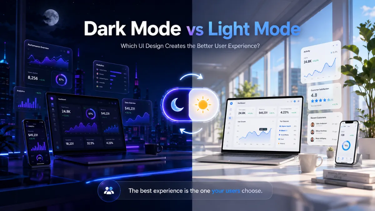
The choice between dark mode and light mode in UI design depends on user context, accessibility requirements, content type, and the overall user experience. Instead of choosing one over the other, the best digital products provide users with the flexibility to select the mode that best suits their environment and preferences.
The debate around dark mode vs light mode in UI design is no longer about determining which option is universally better. Instead, it focuses on understanding when each theme delivers the best experience. Factors such as ambient lighting, reading habits, battery efficiency, accessibility, and visual comfort all influence how users perceive and interact with digital interfaces.
Today’s leading technology companies, including Google and Apple, support both themes across their design systems because they recognize that different users have different needs. Modern user interface design prioritizes adaptability, ensuring that interfaces remain comfortable, accessible, and visually consistent across various devices and usage scenarios.
In this article, you’ll explore the differences between dark mode vs light mode in UI design, compare their advantages and limitations, understand how they impact user experience, and discover practical UI design best practices for creating digital products that are intuitive, accessible, and user-centered.
2. What Is Dark Mode in UI Design?
Dark Mode is a UI design approach that uses a dark-colored background combined with light-colored text and interface elements. Instead of the traditional white or light-gray interface, dark mode UI design creates a high-contrast visual experience that is easier to view in low-light environments. Over the past few years, it has become a standard feature in operating systems, websites, mobile applications, and SaaS platforms because it offers users greater flexibility and personalization.
From smartphones and productivity tools to streaming platforms and developer software, many digital products now include dark mode as an optional theme. This shift reflects a growing focus on user experience design, where interfaces adapt to user preferences rather than requiring everyone to interact with the same visual style.
How Does Dark Mode Work?
In dark mode UI design, designers replace bright backgrounds with darker shades such as charcoal, dark gray, or black while ensuring that text, icons, and interactive elements remain highly visible. However, effective dark mode is not simply a matter of inverting colors. Designers must carefully balance contrast, typography, spacing, and color hierarchy to maintain readability and usability.
A successful dark mode vs light mode in UI design strategy considers:
- Appropriate contrast between text and background
- Comfortable typography for extended reading
- Clear visibility of buttons, icons, and navigation
- Consistent branding across both themes
- Accessibility for users with different visual needs
When these principles are applied correctly, dark mode enhances visual comfort without sacrificing usability.
Common Applications of Dark Mode
Dark mode is particularly effective for digital experiences where users spend long periods interacting with the interface or consume media-rich content.
Some common examples include:
| Application | Why Dark Mode Works Well |
|---|---|
| Video streaming platforms | Creates an immersive viewing experience with fewer visual distractions |
| Gaming applications | Improves focus and enhances visual aesthetics |
| Developer tools and IDEs | Reduces visual fatigue during extended coding sessions |
| Photo and video editing software | Keeps attention on creative content instead of the interface |
| Entertainment and media apps | Delivers a modern, premium appearance |
These use cases demonstrate that dark mode UI design is often chosen based on the user’s environment and activity rather than appearance alone.
Benefits of Dark Mode
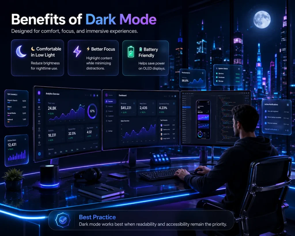
When implemented effectively, dark mode offers several advantages:
- Improves visual comfort in low-light environments.
- Reduces glare from bright screens during nighttime use.
- Can improve battery efficiency on OLED and AMOLED displays.
- Creates a modern and visually engaging interface.
- Helps users focus on images, videos, and multimedia content.
However, these benefits are most noticeable when dark mode is designed with proper accessibility standards and tested with real users.
Key Takeaway
Dark mode is more than a visual trend it is a strategic component of user experience design. When thoughtfully implemented, it enhances comfort, supports personalization, and contributes to a more engaging digital experience. However, understanding dark mode vs light mode in UI design requires evaluating both themes based on user needs, accessibility, and the context in which the product is used, rather than assuming one solution fits every situation.
3. What Is Light Mode in UI Design?
While dark mode UI design has gained widespread popularity, light mode UI design continues to be the default interface for many websites, business applications, and productivity tools. Light mode uses a light-colored background with dark text and interface elements, creating a familiar and highly readable visual experience. Because it closely resembles the appearance of printed documents, many users naturally find it easier to read and navigate, especially in well-lit environments.
For businesses designing digital products, understanding dark mode vs light mode in UI design means recognizing that light mode remains the preferred choice for content-heavy interfaces where clarity and readability are essential.
How Does Light Mode Work?
In light mode UI design, designers use white or light-gray backgrounds paired with darker typography, icons, and interactive elements. This combination creates strong visual contrast, making text easier to scan and improving overall readability. A well-designed light interface also uses whitespace effectively to organize information, guide attention, and reduce cognitive load.
Successful light mode UI design focuses on:
- High text readability for long-form content.
- Clear visual hierarchy and spacing.
- Consistent color contrast for accessibility.
- Easy identification of buttons and navigation elements.
- A clean and professional appearance across devices.
When implemented correctly, light mode provides a comfortable experience for users performing information-rich tasks.
Common Applications of Light Mode
Light mode is widely used in digital products where users need to read, analyze, or interact with large amounts of information.
Some common examples include:
| Application | Why Light Mode Works Well |
|---|---|
| News and blog websites | Enhances readability for long-form articles |
| Business dashboards | Improves data visibility and information scanning |
| Banking and financial platforms | Creates a clean, trustworthy, and professional interface |
| Educational platforms | Supports extended reading and learning sessions |
| Office productivity tools | Makes documents, spreadsheets, and reports easier to review |
These examples show why light mode UI design remains a practical choice for business-focused and content-driven applications.
Benefits of Light Mode
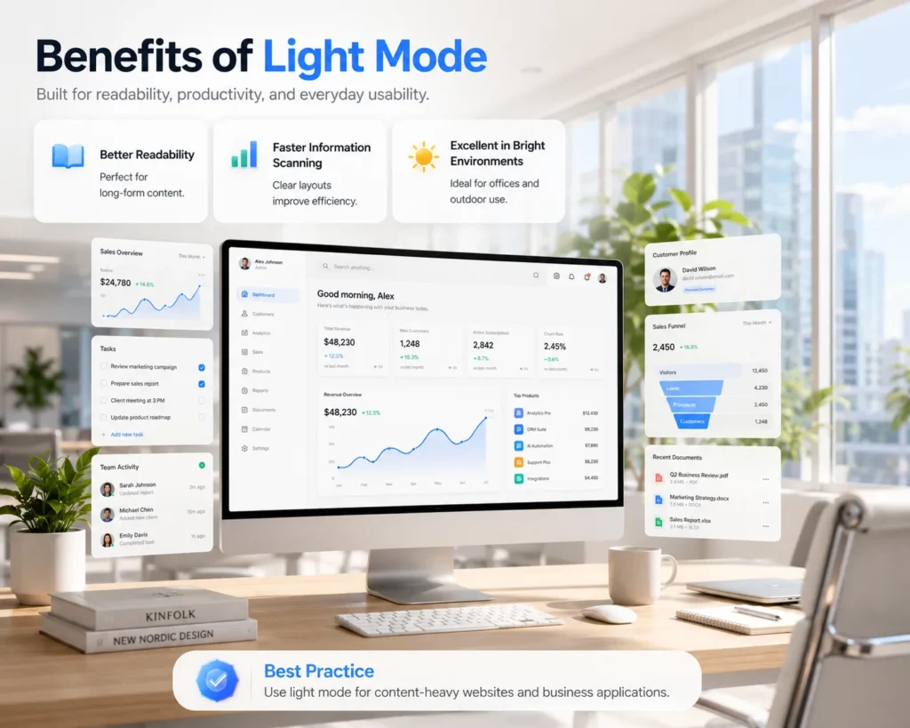
Light mode continues to offer several advantages for both users and designers:
- Improves readability in bright environments.
- Supports faster scanning of text-heavy content.
- Provides excellent color accuracy and contrast.
- Creates a familiar interface for most users.
- Works well for professional, educational, and business applications.
Because of these strengths, many organizations still choose light mode as the default theme while offering dark mode as an optional preference.
Light Mode vs User Experience
One of the biggest advantages of light mode UI design is its ability to reduce cognitive effort when users interact with detailed information. Whether reading reports, browsing product catalogs, or completing online forms, users often find light interfaces more comfortable for extended daytime use.
However, choosing between dark mode vs light mode in UI design should never be based solely on appearance. The most effective user experience design considers the user’s environment, device, task, and accessibility needs before deciding which theme will deliver the best experience.
Key Takeaway
Light mode remains a cornerstone of modern UI design because it delivers excellent readability, supports information-heavy interfaces, and provides a familiar experience for a wide range of users. Rather than viewing it as an alternative to dark mode, businesses should evaluate dark mode vs light mode in UI design based on usability, accessibility, and the specific needs of their target audience.
4. Dark Mode vs Light Mode in UI Design: A Complete Comparison
Choosing between dark mode vs light mode in UI design isn’t about declaring one theme universally better than the other. The right choice depends on how, when, and where users interact with your digital product. A video streaming platform, for example, has very different usability requirements than a banking application or an online learning portal.
The primary goal of user experience design is to create interfaces that support users in different contexts. Instead of forcing a single visual preference, successful digital products evaluate readability, accessibility, usability, and user behavior before deciding how each theme should be implemented.
Dark mode and light mode are just one part of modern interface design. Staying updated with the latest UI design trends helps businesses create digital products that remain visually appealing, user-friendly, and future-ready.
Side-by-Side Comparison
| Design Factor | Dark Mode | Light Mode |
|---|---|---|
| Readability | Suitable for short reading sessions and media-focused interfaces | Better for long-form reading and text-heavy content |
| Eye Comfort | More comfortable in low-light environments | More comfortable in well-lit environments |
| Accessibility | Requires careful contrast management to remain accessible | Naturally provides higher text visibility and readability |
| Battery Performance | Can improve battery life on OLED and AMOLED displays | Uses more power on OLED devices because of brighter backgrounds |
| Visual Style | Modern, immersive, and premium appearance | Clean, professional, and familiar interface |
| Best Use Cases | Entertainment, gaming, creative tools, media apps | Banking, education, business software, blogs, productivity tools |
This comparison highlights that dark mode vs light mode in UI design is less about visual preference and more about selecting the right experience for the intended audience.
Readability and Content Consumption
For applications where users spend significant time reading articles, reports, documentation, or educational material, light mode UI design generally provides a better reading experience. The high contrast between dark text and a light background allows users to scan information more efficiently and reduces cognitive effort during extended reading sessions.
In contrast, dark mode UI design is often preferred for interfaces where visual content such as images, videos, dashboards, or creative projects takes center stage. The darker background minimizes distractions and helps users focus on the primary content.
Accessibility and User Comfort
Accessibility should always be a priority when comparing dark mode vs light mode in UI design. While dark mode can reduce glare in dim environments, poor color contrast or incorrectly selected text colors may create readability challenges for some users.
Similarly, although light mode offers excellent readability in bright conditions, overly bright interfaces may cause discomfort during nighttime use.
The most effective UI design best practices focus on:
- Maintaining sufficient color contrast.
- Using accessible typography.
- Testing interfaces with diverse user groups.
- Following recognized accessibility guidelines.
- Allowing users to choose the interface that best suits their needs.
This user-centered approach ensures that both themes deliver an inclusive and comfortable experience.
Which Theme Should Businesses Choose?
There is no universal winner in the dark mode vs light mode in UI design discussion. The best choice depends on several factors:
- The type of application being developed.
- The target audience.
- The primary user tasks.
- The environment in which the product is used.
- Accessibility requirements.
- User preferences.
For example, a financial dashboard designed for daytime office use may benefit from a clean light mode UI design, while a music streaming application may provide a more immersive experience through dark mode UI design.
Key Takeaway
The debate around dark mode vs light mode in UI design should focus on usability rather than appearance. Instead of asking which theme is better, designers should ask which theme best supports their users’ goals, environment, and accessibility needs. The most successful digital products recognize that flexibility often delivers the best user experience, allowing users to choose the interface that works best for them.
5. Benefits of Dark Mode in UI Design
The growing adoption of dark mode UI design is more than a design trend it reflects the increasing demand for personalized and adaptable digital experiences. From mobile applications and SaaS platforms to streaming services and creative software, dark mode has become a valuable feature because it enhances usability in specific environments and supports different user preferences.
When evaluating dark mode vs light mode in UI design, it’s important to understand that dark mode offers unique advantages when implemented correctly. However, these benefits depend on thoughtful design choices rather than simply changing the background color.
1. Improves Comfort in Low-Light Environments
One of the biggest advantages of dark mode UI design is its ability to provide a more comfortable viewing experience in dimly lit surroundings. Bright screens can feel harsh when users browse at night or work in dark environments, while darker interfaces create a softer visual experience.
This makes dark mode especially suitable for:
- Reading during nighttime
- Watching videos
- Using entertainment applications
- Gaming
- Extended browsing in low-light settings
By reducing excessive screen brightness, users often perceive the interface as more relaxing and less distracting.
2. Creates an Immersive User Experience
A dark interface naturally draws attention toward the content instead of the background. Images, videos, animations, and colorful UI elements stand out more prominently against darker surfaces, creating a modern and immersive experience.
This is one reason why many media-focused applications prefer dark mode UI design, including:
- Video streaming platforms
- Music applications
- Photo editing software
- Design tools
- Gaming interfaces
For these products, dark mode enhances visual storytelling while maintaining a premium appearance.
3. Can Improve Battery Efficiency
Another practical benefit of dark mode is improved battery performance on devices equipped with OLED and AMOLED displays. Because these screens illuminate individual pixels, displaying darker colors often consumes less power than bright white backgrounds.
Although battery savings vary depending on the device and brightness settings, dark mode can contribute to longer battery life for users who spend significant time using mobile applications.
This advantage is particularly valuable for:
- Smartphones
- Tablets
- Wearable devices
However, it’s worth noting that this benefit is less noticeable on traditional LCD displays.
4. Supports User Personalization
Modern user experience design focuses on giving users greater control over how they interact with digital products. Offering dark mode allows people to customize the interface based on their environment, visual comfort, or personal preference.
Providing multiple viewing options helps businesses:
- Improve user satisfaction
- Increase engagement
- Enhance accessibility
- Build a more inclusive digital experience
Instead of assuming every user prefers the same interface, personalization empowers users to choose what works best for them.
5. Reinforces a Modern Brand Identity
Many businesses adopt dark mode UI design because it creates a sleek, sophisticated, and contemporary appearance. When combined with thoughtful typography, spacing, and accent colors, dark mode can strengthen a product’s visual identity and deliver a premium user experience.
Industries that frequently benefit from this aesthetic include:
- Technology
- Entertainment
- Gaming
- Creative software
- Luxury brands
However, visual appeal should always support usability rather than replace it.
Best Practices for Designing Effective Dark Mode
To maximize the benefits of dark mode vs light mode in UI design, designers should follow established UI design best practices:
| Best Practice | Why It Matters |
|---|---|
| Use dark gray instead of pure black | Reduces eye fatigue while maintaining readability |
| Maintain sufficient color contrast | Improves accessibility and text visibility |
| Limit highly saturated colors | Prevents visual strain and enhances consistency |
| Test across different lighting conditions | Ensures usability throughout the day |
| Design both themes together | Creates a consistent user experience across modes |
Following these practices helps create interfaces that are not only visually appealing but also comfortable and accessible.
Key Takeaway
The benefits of dark mode UI design extend beyond aesthetics. It enhances comfort in low-light environments, creates immersive experiences, supports personalization, and can improve battery efficiency on compatible devices. However, in the dark mode vs light mode in UI design discussion, dark mode should be viewed as one option within a flexible user experience design strategy—not as a universal replacement for light mode.
6. Benefits of Light Mode in UI Design
Although dark mode UI design has become increasingly popular, light mode UI design remains the preferred choice for many websites, enterprise applications, educational platforms, and productivity tools. Its clean appearance, excellent readability, and familiarity make it a reliable option for users who spend long periods reading, analyzing information, or completing detailed tasks.
When comparing dark mode vs light mode in UI design, it’s important to recognize that light mode continues to deliver significant usability advantages, particularly in environments where clarity and efficiency are priorities.
1. Enhances Readability for Text-Heavy Content
One of the strongest advantages of light mode UI design is superior readability. The combination of dark text on a light background closely resembles printed books and documents, making it easier for users to read and comprehend large amounts of information.
Light mode is particularly effective for:
- Blog articles
- News websites
- Documentation
- Educational platforms
- Research portals
- Business reports
For applications where reading is the primary activity, light mode UI design often provides a smoother and more efficient user experience.
Users rarely read every word on a webpage. Instead, they scan headings, buttons, menus, and key information before deciding where to focus. A well-designed light interface naturally supports this behavior by creating clear visual separation between content sections.
Benefits include:
- Faster information discovery
- Easier navigation
- Improved visual hierarchy
- Better recognition of interactive elements
These qualities make light mode an excellent choice for websites and business applications where speed and efficiency are essential.
3. Performs Better in Bright Environments
Unlike dark interfaces, which may become difficult to view under direct sunlight, light mode UI design generally maintains better visibility in bright environments. Users accessing websites or mobile apps outdoors often find light interfaces easier to read because the higher overall brightness improves screen legibility.
This makes light mode particularly suitable for:
- Banking applications
- Government portals
- Healthcare platforms
- E-commerce websites
- Business dashboards
Designers should always consider the user’s environment when evaluating dark mode vs light mode in UI design.
4. Creates a Familiar User Experience
Most users have interacted with light-themed interfaces for many years, making them instantly recognizable and intuitive. This familiarity reduces the learning curve and helps users complete tasks with greater confidence.
For organizations targeting a broad audience, light mode UI design often provides:
- Predictable navigation
- Lower cognitive load
- Greater user confidence
- Improved first-time usability
A familiar interface can significantly enhance user experience design, especially for business-critical applications where ease of use is essential.
5. Builds Trust Through a Clean and Professional Appearance
Many industries prioritize clarity, reliability, and professionalism over visual experimentation. In these cases, light mode helps reinforce trust by presenting information in a clean and organized manner.
Industries that frequently benefit from light mode UI design include:
- Financial services
- Healthcare
- Education
- Legal services
- Government organizations
- Corporate software
A minimalist, well-structured interface encourages users to focus on completing tasks rather than adapting to the interface itself.
Best Practices for Designing Effective Light Mode
To maximize the benefits of light mode UI design, designers should follow established UI design best practices:
| Best Practice | Why It Matters |
|---|---|
| Use off-white or soft gray backgrounds instead of pure white | Reduces excessive brightness while maintaining readability |
| Maintain strong text contrast | Improves accessibility and reading comfort |
| Organize content with clear spacing | Makes information easier to scan and understand |
| Use consistent typography and color hierarchy | Creates a cohesive and intuitive interface |
| Test the interface across multiple devices and lighting conditions | Ensures a consistent user experience everywhere |
Applying these principles helps designers create interfaces that are visually balanced, highly readable, and accessible to a wider audience.
Key Takeaway
Light mode UI design remains one of the most effective choices for content-rich and business-focused digital products because it delivers excellent readability, supports faster information scanning, and performs well in bright environments. Rather than viewing it as the opposite of dark mode, businesses should evaluate dark mode vs light mode in UI design based on user goals, context, and accessibility requirements. The best digital experiences prioritize user needs over design trends, ensuring that every interface feels intuitive, comfortable, and purposeful.
7. Accessibility Considerations: Which Mode Creates a Better User Experience?
Accessibility is one of the most important factors when comparing dark mode vs light mode in UI design. While visual preference varies from one user to another, accessibility focuses on ensuring that every user including those with visual impairments, color vision deficiencies, or age-related vision changes can comfortably interact with a digital product.
A visually attractive interface has little value if users struggle to read text, distinguish interactive elements, or navigate the application. This is why modern user experience design places accessibility at the center of every design decision rather than treating it as an optional feature.
Why Accessibility Matters in UI Design
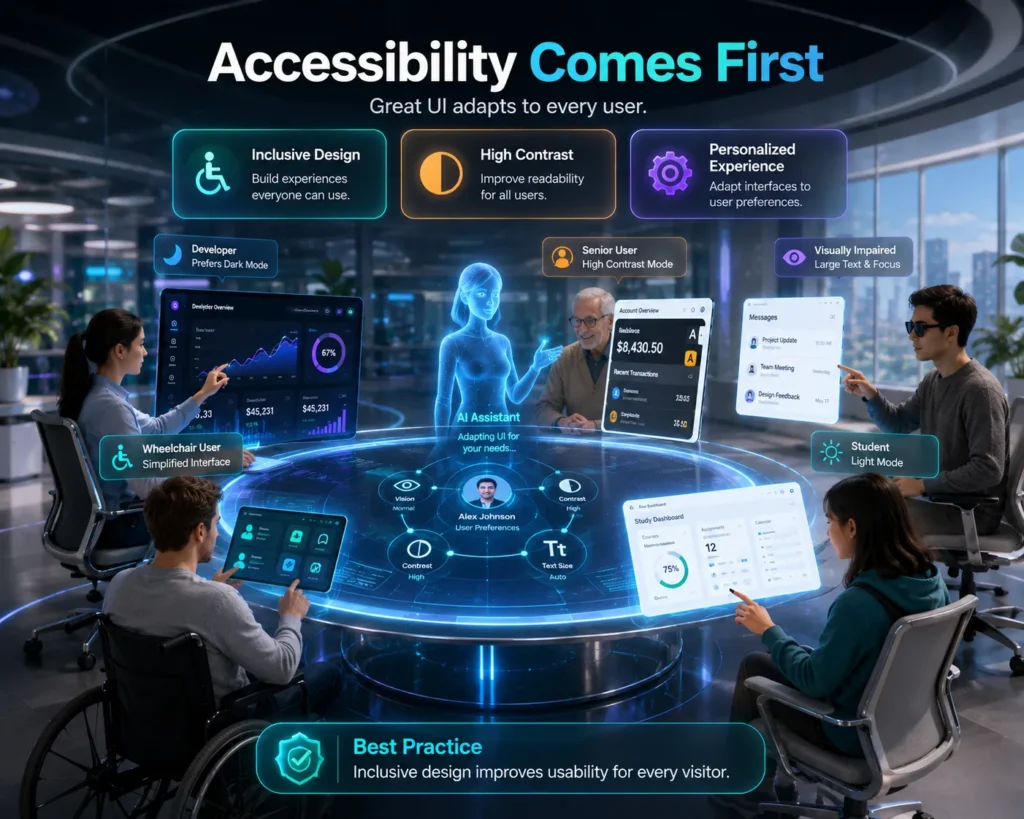
Accessible UI design creates digital products that are usable by the widest possible audience. It improves the overall experience for everyone—not just users with disabilities.
An accessible interface helps users:
- Read content comfortably.
- Navigate with confidence.
- Complete tasks efficiently.
- Reduce visual fatigue.
- Interact consistently across different devices.
Whether designing for mobile apps, websites, or enterprise software, accessibility contributes directly to better usability and customer satisfaction.
Does Dark Mode Improve Accessibility?
Many users assume that dark mode automatically improves accessibility, but that isn’t always true. While dark mode UI design can be more comfortable in low-light environments, poor implementation may reduce readability instead of improving it.
Common accessibility challenges include:
- Low text contrast against dark backgrounds.
- Overly saturated accent colors.
- Small typography that becomes difficult to read.
- Icons that blend into dark interfaces.
To make dark mode accessible, designers should:
- Maintain sufficient contrast between text and background.
- Use dark gray instead of pure black where appropriate.
- Ensure buttons and interactive elements remain clearly visible.
- Test readability across different devices and lighting conditions.
When designed thoughtfully, dark mode can provide a comfortable experience without compromising usability.
For many users, light mode UI design continues to offer the highest level of readability. Dark text on a light background creates strong visual contrast, making it easier to scan long-form content and recognize interface elements quickly.
Light mode is particularly effective for:
- Reading articles and documentation.
- Filling out online forms.
- Reviewing financial information.
- Educational platforms.
- Business dashboards.
Because of its familiarity and clarity, light mode often requires less visual effort during extended reading sessions.
Follow Accessibility Standards
Rather than relying on assumptions, designers should follow recognized accessibility guidelines when choosing between dark mode vs light mode in UI design. Standards such as the Web Content Accessibility Guidelines (WCAG) published by the World Wide Web Consortium provide recommendations for color contrast, typography, and interface usability, helping designers create experiences that work for a broader range of users.
Accessibility testing should include:
- Color contrast evaluation.
- Typography readability.
- Keyboard navigation.
- Screen reader compatibility.
- User testing with diverse audiences.
These practices ensure that accessibility is built into the design process from the beginning rather than added later.
Accessibility Comparison
| Accessibility Factor | Dark Mode | Light Mode |
|---|---|---|
| Reading Long Text | Moderate | Excellent |
| Low-Light Comfort | Excellent | Moderate |
| Bright Outdoor Visibility | Moderate | Excellent |
| Color Contrast Management | Requires careful optimization | Easier to maintain |
| User Familiarity | Moderate | High |
Key Takeaway
Accessibility should guide every decision in dark mode vs light mode in UI design. Neither theme is universally more accessible—the right choice depends on the user’s environment, visual needs, and the way the interface is designed. By following accessibility standards, maintaining strong color contrast, and testing with real users, businesses can create user experience design solutions that are inclusive, intuitive, and comfortable for everyone.
Accessibility, intuitive navigation, and clear visual hierarchy all contribute to better user experiences while reducing common UX mistakes that hurt conversions, helping businesses create more effective digital experiences.
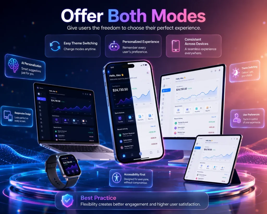
8. Should Your Website or App Offer Both Dark Mode and Light Mode?
As user expectations continue to evolve, flexibility has become a defining characteristic of exceptional user experience design. Instead of asking whether dark mode or light mode is better, businesses should consider whether their users would benefit from having both options.
For many modern digital products, offering both themes is no longer a premium feature—it’s becoming a standard UI design best practice. Whether users are working during the day, browsing at night, or switching between devices, the ability to choose the most comfortable interface improves satisfaction and usability.
When discussing dark mode vs light mode in UI design, the real goal isn’t to promote one theme over the other. It’s to create an experience that adapts to different user needs and environments.
Why Offering Both Modes Improves User Experience
Users interact with digital products in different situations throughout the day. Someone reading reports in a bright office may prefer light mode UI design, while the same person checking updates at night may switch to dark mode UI design for greater visual comfort.
Providing both options allows users to:
- Personalize their viewing experience.
- Improve comfort in different lighting conditions.
- Reduce visual fatigue during extended use.
- Feel more in control of the interface.
- Continue using the product without unnecessary distractions.
This flexibility contributes directly to a more engaging and user-friendly digital experience.
When Should You Offer Both Themes?
Supporting both themes is particularly valuable for products that users interact with frequently or for extended periods.
Examples include:
| Product Type | Why Both Themes Are Beneficial |
|---|---|
| Mobile applications | Users interact throughout the day in different environments. |
| SaaS platforms | Professionals work for long hours and benefit from personalization. |
| Productivity tools | Different tasks require different visual preferences. |
| E-commerce websites | Improves accessibility and customer satisfaction. |
| Educational platforms | Supports comfortable reading during both daytime and nighttime use. |
If users spend significant time within your product, offering theme selection can become a meaningful usability advantage.
Best Practices for Supporting Both Themes
Simply adding a dark mode toggle isn’t enough. A successful dark mode vs light mode in UI design strategy requires both themes to provide an equally polished experience.
Consider these best practices:
- Design both themes from the beginning rather than converting one into the other later.
- Maintain consistent layouts, navigation, and interactions across both modes.
- Ensure logos, icons, and illustrations remain clear and recognizable.
- Preserve your brand identity while adapting color palettes.
- Test both themes with real users across multiple devices.
Consistency ensures that switching themes feels seamless rather than disruptive.
Let Users Decide
One of the core principles of user experience design is respecting user preferences. Instead of assuming everyone prefers one interface, successful products empower users to choose the experience that best suits their needs.
Many leading digital products now:
- Automatically detect the device’s system theme.
- Allow manual theme switching.
- Remember user preferences across sessions.
- Synchronize theme settings across devices.
These features create a more personalized and frictionless user journey.
Business Benefits of Offering Both Modes
Supporting both themes doesn’t only improve usability it can also create measurable business value.
Potential benefits include:
- Higher user satisfaction.
- Increased engagement and retention.
- Better accessibility compliance.
- Improved brand perception.
- Enhanced product competitiveness.
As personalization becomes a standard expectation, businesses that provide flexible interface options are better positioned to meet diverse user needs.
Key Takeaway
The discussion around dark mode vs light mode in UI design isn’t about selecting a single winner. The most successful digital products recognize that users have different preferences, environments, and accessibility requirements. By offering both dark mode UI design and light mode UI design, businesses create adaptable experiences that improve usability, increase user satisfaction, and support long-term engagement.
9. UI Design Best Practices for Dark Mode and Light Mode
Choosing between dark mode vs light mode in UI design is only one part of creating an exceptional digital experience. The real success lies in how well each theme is designed. A poorly implemented dark mode can reduce readability, while an unoptimized light mode can cause visual fatigue. Regardless of the chosen theme, following proven UI design best practices ensures that users enjoy a consistent, accessible, and intuitive experience.
For businesses, these practices not only improve user experience design but also increase user engagement, build trust, and strengthen brand perception.
1. Prioritize Readability Above Visual Style
No matter which theme you choose, users should be able to read and understand content effortlessly. Typography, spacing, and contrast have a much greater impact on usability than color alone.
To improve readability:
- Choose legible font sizes and weights.
- Maintain sufficient spacing between text elements.
- Avoid overly bright or highly saturated colors.
- Ensure strong contrast between text and background.
Remember, users visit your product to complete tasks not to admire color schemes.
2. Maintain Consistent Visual Hierarchy
A good UI design guides users naturally through the interface. Headings, buttons, forms, and navigation should follow the same visual hierarchy in both themes.
Maintain consistency by:
- Using identical layouts across both modes.
- Keeping navigation in familiar locations.
- Applying consistent spacing and alignment.
- Using the same interaction patterns.
Users should feel that only the colors have changed not the entire experience.
3. Design Accessible Color Palettes
Color selection plays a critical role in dark mode vs light mode in UI design. Simply inverting colors often leads to poor usability and accessibility issues.
Instead:
- Use dark gray rather than pure black for dark interfaces.
- Avoid pure white backgrounds when softer tones improve comfort.
- Select accent colors that remain distinguishable in both themes.
- Verify color contrast against accessibility standards.
Thoughtful color choices improve comfort while preserving your brand identity.
4. Test Across Different Devices and Environments
An interface that looks perfect on one device may perform differently on another. Users interact with products on smartphones, tablets, laptops, and desktop monitors under varying lighting conditions.
Comprehensive testing should include:
- Bright outdoor environments.
- Dimly lit rooms.
- Large desktop screens.
- Mobile devices.
- Different operating systems and browsers.
Testing across real-world scenarios helps identify usability issues before users encounter them.
5. Let User Research Guide Design Decisions
The most effective user experience design decisions come from understanding user behavior rather than following design trends. Conducting usability testing and gathering feedback allows designers to identify which theme best supports their audience.
Modern design teams increasingly rely on AI in UX research to understand user behavior, identify usability issues, and make data-driven interface decisions before implementing features like dark mode and light mode.
Useful research methods include:
- User interviews.
- Usability testing.
- Heatmap analysis.
- Session recordings.
- A/B testing.
- User feedback surveys.
Instead of asking which theme looks better, ask which one helps users complete tasks more efficiently.
UI Design Best Practices Checklist
| Best Practice | Why It Matters |
|---|---|
| Prioritize readability | Makes content easier to understand |
| Maintain consistent layouts | Creates a familiar user experience |
| Use accessible color contrast | Improves usability for all users |
| Test both themes thoroughly | Identifies usability issues early |
| Base decisions on user research | Ensures design choices solve real user problems |
| Allow theme personalization | Improves satisfaction and engagement |
Key Takeaway
The success of dark mode vs light mode in UI design depends far more on thoughtful execution than on the theme itself. By prioritizing readability, accessibility, consistency, and user research, businesses can create interfaces that perform well in any environment. The best user experience design doesn’t force users to adapt it adapts to them through careful planning, testing, and continuous improvement.
10. How CrossShores Infotech Creates User-Centered UI Experiences
Creating an exceptional digital product involves much more than choosing between dark mode vs light mode in UI design. Every interface should be designed around the people who use it their goals, behaviors, preferences, and challenges. At CrossShores Infotech, we believe that successful user experience design starts with understanding users and translating those insights into intuitive, accessible, and business-focused digital solutions.
Rather than following temporary design trends, our approach focuses on creating interfaces that deliver measurable value for both users and businesses.
We Design with Users at the Center
Every project begins with understanding how users interact with a product. By studying user behavior, business objectives, and industry requirements, we create interfaces that feel natural from the very first interaction.
Our UI design process focuses on:
- Understanding user needs and expectations.
- Creating intuitive navigation structures.
- Simplifying complex user journeys.
- Improving task completion rates.
- Reducing friction across every touchpoint.
This user-first approach helps businesses build products that customers enjoy using and trust over time.
Accessibility Is Built Into Every Design
Inclusive design is a fundamental part of modern user experience design. Whether implementing dark mode UI design, light mode UI design, or both, accessibility is considered throughout the design process rather than treated as a final checklist.
Our accessibility-focused practices include:
- Optimizing color contrast for readability.
- Designing interfaces that support diverse user needs.
- Creating clear typography and visual hierarchy.
- Ensuring consistent navigation across devices.
- Testing designs for usability before development.
By prioritizing accessibility, businesses can reach a broader audience while delivering a better overall user experience.
Balancing Aesthetics with Usability
An attractive interface should never come at the expense of usability. At CrossShores Infotech, every visual decision is made with functionality in mind. Whether selecting color palettes, typography, layouts, or interaction patterns, we focus on creating experiences that are both visually engaging and easy to use.
This balanced approach helps ensure that digital products are:
- Easy to navigate.
- Visually consistent.
- Optimized for different devices.
- Aligned with brand identity.
- Designed for long-term scalability.
Instead of designing for trends, we design for lasting usability.
Supporting Modern Digital Experiences
Today’s users expect flexibility. They interact with websites and applications across multiple devices, environments, and lighting conditions. That’s why we help businesses implement adaptable interfaces that support both dark mode UI design and light mode UI design where appropriate.
Our design strategy emphasizes:
- Responsive and adaptive interfaces.
- Theme consistency across platforms.
- Performance-focused UI design.
- Seamless user interactions.
- Personalized digital experiences.
By combining usability, accessibility, and thoughtful design, we create products that remain relevant as user expectations continue to evolve.
Why Businesses Choose CrossShores Infotech
Organizations partner with CrossShores Infotech because we combine design thinking with technical expertise to create digital products that deliver real business results.
Looking for a partner to create intuitive websites, mobile apps, or enterprise platforms? Explore our UI/UX design services to see how CrossShores Infotech helps businesses build user-centered digital experiences.
Our UI/UX services focus on:
- User-centered UI design
- Research-driven user experience design
- Responsive web and mobile interfaces
- Accessibility-focused digital experiences
- Modern design systems
- Scalable enterprise applications
- Conversion-focused product design
Every solution is built to enhance usability, strengthen customer engagement, and support long-term business growth.
Key Takeaway
The discussion around dark mode vs light mode in UI design ultimately comes down to understanding users rather than choosing a visual style. At CrossShores Infotech, we combine research, accessibility, and proven UI design best practices to create digital experiences that are intuitive, adaptable, and aligned with business goals. By focusing on real user needs, we help organizations build products that not only look exceptional but also deliver meaningful and lasting results.
11. Frequently Asked Questions About Dark Mode vs Light Mode in UI Design
1. Is dark mode vs light mode in UI design a matter of personal preference?
Partly, yes. Personal preference plays an important role, but it shouldn’t be the only deciding factor. The right choice depends on the user’s environment, the type of task they’re performing, accessibility requirements, and the overall user experience design. For example, someone reading documentation in a bright office may prefer light mode UI design, while another user watching videos at night may find dark mode UI design more comfortable.
2. Does dark mode reduce eye strain?
Dark mode can reduce discomfort caused by bright screens in low-light environments, making it more comfortable for nighttime use. However, it doesn’t automatically reduce eye strain for every user or every situation. Factors such as screen brightness, text contrast, font size, and viewing duration also affect visual comfort.
3. Is light mode better for reading?
In many situations, yes. Light mode UI design generally offers better readability for long-form content because dark text on a light background is easier to scan and comprehend. This makes it ideal for articles, reports, documentation, educational platforms, and business applications where users spend extended periods reading.
4. Which mode is more accessible?
Neither mode is universally more accessible. Accessibility depends on how well the interface is designed. A properly designed dark mode UI design with sufficient contrast can be highly usable, while a poorly designed light interface may also create readability issues. Following accessibility standards and testing with real users is more important than choosing one theme over the other.
5. Does dark mode save battery life?
On devices with OLED or AMOLED displays, dark mode can improve battery efficiency because darker pixels consume less power. However, the actual savings vary depending on the device, brightness settings, and usage patterns. On LCD screens, the difference is usually minimal.
6. Should every website or mobile app offer both themes?
Not necessarily, but many modern products benefit from offering both dark mode and light mode. If users spend significant time within your application or use it in different lighting conditions, providing theme selection improves personalization, accessibility, and overall user experience.
7. Which industries benefit most from dark mode?
Industries that focus on media-rich or visually immersive experiences often benefit from dark mode UI design, including:
- Streaming platforms
- Gaming applications
- Creative software
- Photo and video editing tools
- Entertainment platforms
These products use darker interfaces to emphasize content while reducing distractions.
8. How can businesses choose the right UI theme?
Businesses should base their decision on user research rather than assumptions. Understanding the target audience, primary user tasks, accessibility needs, and usage environment helps determine whether light mode UI design, dark mode UI design, or support for both themes will deliver the best experience.
Whether you’re building a new digital product or improving an existing one, the right design strategy makes all the difference. Discover how our UI/UX design services help businesses create intuitive, accessible, and conversion-focused digital experiences.
12. Conclusion
The discussion around dark mode vs light mode in UI design isn’t about finding a universal winner it’s about creating experiences that work best for the people using your product. Both themes offer unique advantages, and each serves different user needs depending on the environment, content type, accessibility requirements, and individual preferences.
Dark mode UI design excels in low-light environments, media-rich applications, and personalized user experiences, while light mode UI design continues to provide superior readability, familiarity, and efficiency for content-heavy and business-focused platforms. The most successful digital products recognize that users are diverse, and flexibility often leads to better usability.
Instead of following design trends, businesses should prioritize user experience design by understanding user behavior, conducting usability testing, and implementing interfaces that are intuitive, accessible, and adaptable. Offering both themes when appropriate empowers users to choose the experience that best fits their context, leading to higher satisfaction and stronger engagement.
At CrossShores Infotech, we help businesses create user-centered digital experiences that combine modern UI design, accessibility, and research-driven decision-making. Whether you’re designing a new website, developing a mobile application, or modernizing an enterprise platform, our focus is on building interfaces that are visually compelling, easy to use, and aligned with your business objectives.
Ultimately, the answer to dark mode vs light mode in UI design isn’t choosing one over the other it’s designing digital experiences that adapt to users, support their goals, and deliver lasting value.